Effective Mailer Design Best Practices for Campaign Success
In an age where everyone is glued to their phones and flooded with digital ads, it’s easy to overlook the power of a printed mailer. But ask anyone who’s run a successful campaign, and they’ll tell you: political mail still works. It’s physical, targeted, and credible—especially for older voters and those who regularly participate in local elections. The real question isn’t whether mail matters, but whether it’s being designed well enough to matter. And that’s what we’re here to fix.
Whether you’re launching your first city council run or leading a state-level campaign, how your mailer looks and reads will shape how it lands—both in the mailbox and in the voter’s mind. Below are 10 best practices drawn from real-world campaign experience to help you create political mailers that aren’t just attractive, but persuasive and effective.

Why Political Mailer Design Still Matters Most
Design is not decoration. In campaign mail strategy, design is persuasion. Every visual decision—fonts, color, layout, spacing—shapes how voters perceive your message. Well-designed political mail helps establish credibility from the very first glance. It reflects professionalism, reinforces campaign messaging, and increases retention. Done right, it can even drive conversions through donations, turnout, or volunteer signups. In a world where digital noise is constant, mail still commands space and time. But with just 5–7 seconds of a voter’s attention, every element has to do its job. That makes layout, images, and CTA placement absolutely critical to campaign outcomes.
A professionally designed political mailer helps:
-
Build candidate name recognition
-
Reinforce key messages across multiple channels
-
Improve voter recall and emotional response
-
Guide the reader toward a clear next step (vote, donate, volunteer)
1. Define the Purpose of Your Political Mailer
Before designing, ask: what’s the goal of this mailer? That goal drives every decision—from headline to imagery to format. Mailers that lack a clear purpose often fall flat, leaving voters confused or uninterested. You’re paying to reach households directly, so each piece should serve a distinct function in your campaign strategy. Whether it’s an early introduction or a final GOTV push, clarity of purpose will sharpen your message and streamline the design. Think of your mailer like a billboard: it should say one powerful thing clearly and confidently.
Common mailer goals include:
-
Introduction mailers for early name ID
-
GOTV postcards with dates, locations, and reminders
-
Contrast or opposition mailers that define the stakes
-
Fundraising appeals sent to supporters
-
Ballot explainer mailers for voter education
Pro Tip: Focus on a single, clear objective for each piece. Trying to say too much weakens your message.
2. Use a Visual Hierarchy That Guides the Reader’s Eye
People don’t read political mail—they scan it. That’s why visual hierarchy is one of the most important aspects of political mailer design. Your layout should guide the reader’s eyes from headline to photo to CTA in a smooth, intuitive flow. Designers often use Z-pattern or F-pattern layouts because they match how our eyes naturally move across the page. Headlines need to pop. Images need to draw attention. And calls to action need to be unmissable. If voters feel overwhelmed or confused by your layout, they’re more likely to toss your mailer than engage with it.
What to emphasize:
-
Big, bold headline at the top
-
Hero image of the candidate or key issue
-
Brief, persuasive body copy
-
Strong CTA, ideally in a shape or color block
Use font size, spacing, color contrast, and image placement to reinforce the flow. Don’t rely on guesswork—design with intention.
3. Deliver One Message Per Mailer
When it comes to political mail, less is more. The strongest mailers focus on a single theme or value proposition and reinforce it from top to bottom. Trying to cover multiple issues or cram in a long list of talking points only dilutes your message. Voters aren’t flipping through your mailer like a magazine—they’re scanning it in seconds. A well-defined message stands out, sticks in their memory, and increases the chances they’ll take the action you want. Simplify, prioritize, and keep your content laser-focused on the one takeaway you want voters to remember.
Keep your message simple:
Headline: “Jane Lee Fights for Small Businesses”
Subhead: “Experienced. Local. Independent.”
Body: 2–3 lines about experience or vision
CTA: “Vote Jane Lee – Tuesday, November 5th”
4. Choose the Right Format and Mailer Size
Format isn’t just an aesthetic choice—it’s a strategic one. The size and shape of your mailer affect not only how it’s perceived, but how much you can say, how much it costs to print and mail, and how likely it is to stand out in a stack of envelopes. Oversized postcards have impact. Folded mailers offer more space. Enclosed letters feel more personal. Consider your goals, your audience, and your budget when deciding. A small postcard might be perfect for a reminder, while a larger, folded piece might work best for storytelling or issue education.
Popular formats:
-
Postcards (4″x6″, 6″x9″) – affordable, fast, perfect for reminders
-
Oversized postcards (6″x11″, 8.5″x11″) – more space for storytelling, more visual impact
-
Self-mailers (folded brochures) – ideal for legislative updates or long-form messaging
-
Enclosed letters – personal, effective for fundraising or sensitive content
Insights: Oversized mailers stand out more in the stack, but they come with higher postage. Choose based on ROI, not just size.
5. Use High-Resolution, Relatable Imagery
A single strong photo can often say more than an entire paragraph. That’s why visual quality matters so much in political mail. Use real photos of your candidate interacting with the community—at local events, in familiar places, with relatable people. Voters trust what feels familiar. Avoid dark, over-processed, or stiff images. Aim for clarity, warmth, and authenticity. And from a technical standpoint, always use 300 dpi images for print to avoid pixelation. Low-quality photos suggest low-quality campaigns—don’t let poor visuals sabotage your message.
Do:
-
Use 300 dpi resolution (for professional print)
-
Feature real, local imagery if possible
-
Show the candidate in community settings—schools, parks, neighborhoods
-
Edit for brightness and clarity, not glamour
Don’t:
-
Use stock photos that feel generic or inauthentic
-
Crowd the design with too many images
-
Use dark or overly filtered images
Voters connect with people. Your candidate should look approachable, confident, and real.
6. Apply Campaign Colors and Font Styles Consistently
Your mailer should look and feel like every other part of your campaign. That means matching your website, yard signs, and social graphics with consistent color palettes and typography. Branding builds familiarity, and familiarity builds trust. Use color strategically—blue evokes trust and progress, red creates urgency and energy, and green signals reform and renewal. Your fonts should be bold, easy to read, and consistent across formats. Avoid mixing too many styles or using novelty fonts that might feel off-brand or amateur. Clean, strong, and consistent is the way to go.
Political color meanings:
-
Blue: Stability, progress, trust
-
Red: Energy, urgency, strength
-
Green: Reform, community, sustainability
-
Black/Grey: Professionalism, experience
Choose one headline font (bold, sans-serif like Montserrat) and one body font (clean and readable like Open Sans). Stick with 2 fonts max across all your campaign materials to build brand cohesion.
7. Write a Call-to-Action That Demands a Response
At the end of the day, your mailer needs to move someone to act. That’s where your CTA comes in. It should be specific, action-oriented, and immediately clear. Voters shouldn’t have to hunt for what you want them to do. Make it obvious and urgent. Do you want them to vote on a specific date? Visit your campaign website? Return their ballot? Use big fonts, bright backgrounds, or shapes to make the CTA stand out. When in doubt, test it at a glance—can you spot the CTA in one second? If not, make it louder.
Examples of high-impact CTAs:
“Vote Tuesday, November 5th – Polls Open 7 AM”
“Scan to Learn More About Jane’s Plan”
“RSVP for the Town Hall – Visit JaneForCouncil.com”
“Return Your Ballot by Nov 1”
Use bold shapes, highlight colors, and clear positioning to make your CTA pop.
8. Align Mailer Design With Your Digital Strategy
Political mail doesn’t operate in a vacuum. The most successful campaigns treat every piece of mail as part of a bigger, integrated outreach plan. Your print design should look and feel just like your digital ads, social graphics, and email blasts. This creates consistency across touchpoints and reinforces your message wherever the voter sees it. Use QR codes to connect mail to mobile, create landing pages that match the flyer’s design, and take advantage of USPS Informed Delivery previews. When everything works together, your mailer does more than land—it lingers.
Great campaigns ensure that their flyers align with:
-
Social media ad visuals
-
Landing page messaging
-
Email subject lines
-
Informed Delivery previews (USPS)
-
QR codes that track engagement
9. Avoid Common Political Mail Design Mistakes
Even strong messages can get buried if the design falls apart. And most mistakes are completely preventable. One of the biggest issues? Font size. If your grandma can’t read it without glasses, it’s too small. Another frequent problem is layout—don’t crowd the address block or forget space for postal barcodes. Always use the correct color mode (CMYK) and resolution (300 dpi) for print. And never skip legal requirements like disclaimers or union bugs. A great design can’t save a mailer that’s noncompliant or unreadable. Always do a test print and double-check everything before hitting “send to print.”
Top mistakes to avoid:
-
Using fonts that are too small or decorative
-
Forgetting to leave space for USPS address block
-
Printing without adding bleeds or crop marks
-
Leaving out the “Paid for by…” disclaimer
-
Including too many competing visuals or CTAs
Always review your final file from both a printer’s and a voter’s perspective.
10. Prepare Files for Print AND Track Results
Designing a mailer isn’t just about how it looks—it’s also about how it performs. First, make sure your files are prepared properly for print. That means CMYK color mode, high resolution, and proper bleeds. If you’re sharing the piece digitally, use RGB and optimize for file size and screen quality. But don’t stop there. You should also track performance. Add QR codes with UTM parameters, use personalized URLs, or assign trackable phone numbers. This helps you understand what’s working, where, and why. Over time, that data helps you design even better mailers with smarter targeting.
For Print:
-
Set to CMYK color mode
-
300 dpi resolution
-
0.125” bleed on all sides
-
Export as print-ready PDF with crop marks
For Digital/Email:
-
Use RGB color mode
-
JPG/PNG files under 1MB
-
Optimize for social sharing dimensions
To Track Performance:
-
Add QR codes with campaign UTM links
-
Use PURLs or tracked phone numbers
-
Monitor response rates across districts
-
Split test mailers in small batches
Conclusion
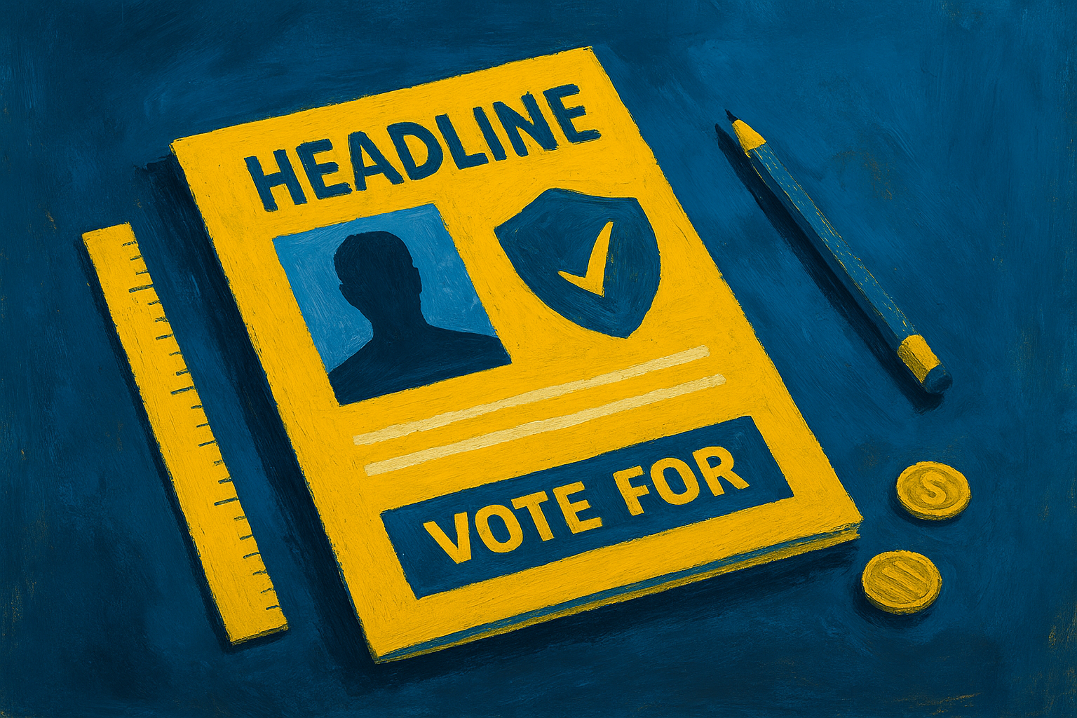
Political mail is still one of the most direct and trusted forms of voter outreach. But it’s only effective if the design is intentional, persuasive, and actionable. A great flyer grabs attention, delivers one strong message, and moves the reader to act. In competitive elections, every touchpoint counts—and well-designed mailers can give you an edge where it matters most: inside the voter’s home.
By applying these 10 best practices, your campaign flyers will not only look polished—they’ll deliver real results: higher turnout, better name recognition, and stronger message retention.
Ready to Design a Winning Campaign Mailer?
We specialize in political flyer design and production that delivers results. Whether you need compliant layout templates, full design support, or print production services, we’re here to help.

Jon Sutton
An expert in management, strategy, and field organizing, Jon has been a frequent commentator in national publications.
Author | Partner